Tuesday 1 April 2014

Components of a Games Engine

Components of a Games Engine
Renderer:

This is a process which you generate an image from a model by using certain computer programs or gaming engines, some of those could be CryENGINE 3, Unity and Unreal Engine 3. The results when having done this would be called a rendering.

A renderer has a number of tasks that it need to compete in order to produce a finished product, some of these tasks include processing 3D models which you would create, this would include everything from level designs and characters you create. Another could be the camera view point and where it would be positioned within your game in scene and game-play. Another could be deciding when in the game what the player is allowed to see and what they cannot see, this would be certain parts in the game where something is blocking the view to the next part of the game, it is done to save time and effort from the renderer having to render images or game-play which the player dost necessarily need to see at that point in the game. Finally another would be the lighting effect which is a very important factor in a game especially if the games genre is something to do with horror as lighting is significantly important to producing a feel to the game.


There are three main effects that are used in games today, one of the techniques used in this is called Levels of Detail or LOD for short, this would include small details within the game such as rendering something using geometry which only really needs a lot of polys when the object is close to the cameras viewpoint, so when the object is further away using a low poly models isn't necessarily a bad thing as the player wouldn't be able to tell the different with the naked eye, most notable games that use this technique are Red Dead Redemption, Grand Theft Auto 5 and Grand Turismo 5. Another would be not allowing the player to see too much or the “To much seen at once” which basically is about hiding certain sections of the game by using buildings or objects which would obstruct the players view which aids when rendering as is would save someone a lot of time doing this. The final technique would be Culling of Geometry; this is used because computers don’t have any concept of distance or depth, so the computer would have to work out which objects are in front of others. When using Culling this is trying to make this process easier and more efficient as possible. Some of the problems of real time rendering could be the fact that some of it might not be needed; this would result in a lot of wasted rendering which could be called “overdraw” which results in no optimisations so would end up being a slow game due to the frame rate having changed, to put it simpler, if the player doesn't really need to see s part of the game then there isn't any real point in allowing it to be rendered. 

Collision Detection & Physics:

Collision detection is a contact of which one object touches another. In games today collision detection is used in almost everything, when it comes to first person shooters there are a number of ways it is used from the bullets making contact with either another character, walls, fences and other things. When it comes to different games like fighting games then the collision detection's would be programmed for when the characters land blows on each other or when then make contact with objects in the game like boxes, fences etc and also the floor. Finally another game where collision detection is used greatly is in sport games such as football, rugby and tennis, using football as an example, games like FIFA where you would have to program collision detection for when a player kicks the ball, although there are different ways a player can hit the ball may this be through the standard foot, head and ever chest. Other players would have to be taken into consideration for when the ball hits them from another player shooting or even when player collide with each other through tackling.

 Computer game physics involves the introduction of the laws of physics which is then put into a simulation or game engine; this is often seen in 3D computer graphics which has the purpose of giving the sense of effects being more real to the spectator.

There’s different ways that physics can be used in games. There are two separate types of physics simulations; they are rigid body and then soft body. When it comes to rigid simulations the objects are grouped into categories that are based on how they would or should work together and are less performance demanding. Then for soft body it is the physics involved for simulating individual segments of each object so that it would behave in a way that is deemed to be more realistic.

Another aspect of computer game physics is particle systems which is a common feature. Early games that used this feature would often repeat the same sequence like an explosion over and over again in each circumstance. Yet in when comparing this to real world situations an explosion would depend on a variety of things which would include the types of terrain that would be there, the altitude of the explosion and any kind of solid objects which may be near such as bodies that would be impacted. Particle systems allow a number of physical phenomena which 
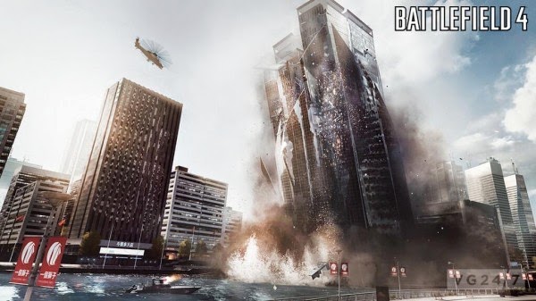
could be smoke, flowing water etc. Games where this would be most common would be games like Call of Duty and Battlefield, Battlefield being more specific as it has the added feature of buildings and other objects which crumble due to blast or explosions from other objects which is something that Call of Duty lacks. 

Artificial Intelligence:

Artificial Intelligence in computer games is used to project and capture human-like intelligence, human behavior or subjects of intelligent behaviors which is primarily seen in NPC’s or non-player characters.

There are different types of Artificial Intelligence within the gaming world, one is of course Game AI, this kind of AI is all about making the game more fun and enjoyable for the player to experience, the other is Scientific AI, this type of AI is designed in an attempted to simulate real intelligence which would be human behavior. There are many different job roles in a way that Game AI needs to do, some of those could be that they would have to navigate through different levels of a game, this would be a difficult task for any game as they would need to program the AI and its behavioral patterns to adapt to this, a great example of this could be the game FIFA, as the team would have to give each individual player certain types of behavior, whether that would be to stand idle or tackle or shoot, the amount of detail that goes into creating a game like that goes unnoticed in most gamers today. Another task that the AI would have to do would be to act out strategies, again this brings be back to the game, FIFA as the player would have to decide on such things like formations and where the players would play, if the player decides during the game to change any other mentioned above then the AI’s would have to adapt to the new strategies so the programmers would have to implement each different formations and positions into each player which in fairness is a lot of work which again it goes unnoticed with majority of players today.  

One of the biggest questions that are raised when it comes to AI characters is that simple question, do they cheat? The answer to that would be yes, they do cheat. Some of the reasons that the programmers would let this happen would be because it would make the game more enjoyable in a way, it would enable the game to be different each time the player plays. An example of this is best shown in a first-person shooter, as the human controlled player would have to aim with precision and technique depending on what weapon they are using, comparing this to an AI controller character where they would always have near perfect aim, their weapons would have little to no recoil.

Next I will be using an example of AI in a NPC from a game that I have played, the game that I have chosen is the first Metal Gear Solid, the NPC that I will be explaining are the guards from the game.
The guards in the game are very simple and have a simple objective which is to patrol the area and look for you once spotted, the guards are programmed and have their own paths which they follow on each level of the game. Instead of just walking round the map aimlessly, they do have other animations which make them seem less boring in a way, this involved stretching every now and then and occasional chat with another soldier.

There are three different behavioral statuses which the first one being Alert, which means they've spotted you and will pursue you until they lose sight of you, if you are spotted then the timer which would be displayed would reset and you would have to try and evade the guards. The second is Evasion which is a state where you have evaded the guards, but they are still on alert and searching for you, again there is another timer which runs down, if you are spotted then the process from going to the first alert to Evasion mode. Finally the third status is when you have stayed hidden during the Evasion status and now the guards are back to being on patrol. The first two alert statuses cause your map to be temporarily blocked until you evade them. 

Middleware:

This is software which is used by computers which enables them to provide services to software applications that are beyond those available from their operating systems. Usually Middleware can be portrayed as “Software Glue” as it holds everything together. Using middleware makes it easy for the software developers to perform communication inputs and outputs; this will then let them focus on a specific purpose of the application.

Middleware helps develop a game as is relieves a lot of pressure for the development teams, this means that they won’t have to go through the stress or hassle of having to code specific elements of the game individually, this then means that if they did do this themselves then it may delay the development process and would take longer for the game to be released. The middleware software can be expensive, but purchasing this piece of software would prove better than hiring employees to code the game themselves in the long run, hiring more people would cost money paying them and would use up valuable time for them coding the game for endless hours each day when it could simply be done by using middleware software which has already been tested and proven to work and has a greater chance of working.  Also using middleware allows you to change the applications behaviour without having to modify the code of the application.

Middleware can have its problems; some of those being that a buggy piece of middleware would be considered as a twice as bad because instead of freeing you to focus on another piece to function on, it makes you focus your attention there on the code which was written by someone anonymous   which would prove hard for your company to follow if they don’t understand what the stranger has put. Another would be that if the engine maker goes out of business, hasn't got the financial backing or just decides they don’t want to be in the middleware business anymore then that is when you’re in trouble. The engine doesn't necessarily cease to exist and neither does your licence, but on the other hand you shouldn't expect to have their support anymore.  As everything has its bad points, there are some benefits to having middleware software, one of those being the middleware software provides you with a lot more code than you could ever write yourself, this would be a small price to pay for something that would cost a lot more for you to learn, another would be that the middleware suppliers can actually afford to keep larger and more expensive teams which can work on any given piece of functionality than any other indie game developers could ever do.

Havok AI gives the designers an easy control when it comes to required features in the game. It then focuses on the characters movements and large scale environments, so for this it uses path finding and path following and also it would use navigation meshes. These would allow them to simply pre-program paths for the characters which they would follow. All they would then need to do would be to specify to whatever kind of middleware they have to give specific information. This would be used to influence the characters behavior but that would depend on the environment or situation. The middleware intelligently specifies queries that can give non player characters or NPC’s the ability to make their own decisions about the environment. The NPC’s would also be able to predict the movements of other which are located I the environment and would be able to function accordingly to the information provided, this would be considered to be an interesting feature. So all of this indicates there wouldn't be any kind of random or accidental collisions between other none player characters, thus adding a sense of realism to the environment.

Tuesday 4 February 2014

Mega Mike Development Blog Updates

In this blog post I will be writing and updating each stage in developing the project, Mega Mike. I will be writing out what my aims or targets for that day were, what I actually got up to that day and then at the end writing if I accomplished them and what I will be doing the following day.

Today's date: February 3rd, 2014.

In today's lesson I started the Mega Mike development process, at the start I began doing some game research into other iPad based games and looking at their main menu's and then writing a summary on them explaining how they're good and what makes them special. Next I then began to outline my own main menu system and what would be good to feature for it.

So to summaries what my objectives were today, they were:

  • Take a look at the brief and find out what I have to do. 
  • Gather research on other iPad based games.
  • Then begin my own menu concepts.
I feel that I accomplished all that I wanted to do today and in tomorrows lesson I will be starting off coming up with a few concepts for main menu designs along with different button concepts 

Today's date: February, 4th, 2014.

In today's lesson I re-capped on what I did the previous day, then moved onto actually creating concepts for my own main menu systems. Next I created the start of my concepts by looking at what kind of buttons might be included on the menu, colours, and what kind of style I wanted to use. After this I came up with three different concepts in which the buttons and the layout of the menu would be placed and then produced one which was in colour. Finally I created three different buttons which would be used within the game that would move the character left and right. 

Summary of today's targets:
  • Re-cap what I did the day before.
  • Produced some concepts of the layout.
  • Create a few button concepts. 
In today's lesson I set myself a target of coming up with different concepts for a main menu design, along with a couple of buttons which could be used within the game, I accomplished these targets in today's lesson and am fully set for the next date. Next time I will be creating more concepts for different buttons, different ones from the ones I did today, and then finding a few different fonts which could be used for the design.

Today's date: February, 24th, 2014.

In today's lesson I had a meeting with my tutor which involved what I had done and what I would need to do to improve my work, a quick summary of the meeting was about improving my buttons such as the left & right control and also the other various buttons like the jump button. my task was to make them more visually appealing and create some kind of depth in them like an example could be one of the old arcade machine buttons, although they did not have any detail on them, they are still iconic in how they are dish shaped and have the little dip in them.

So after the meeting I went away and edited the work that needed to be updated. I started by editing the jump button and give more colour and added bits of shading to it to make it more realistic in a way, after this I started on the left and right buttons, again I changed the colours of them and added shading to make them more visually appealing.

Summary of today's targets:

  • Have a meeting with my tutor to discuss my progress.
  • Update the chosen pieces of work that needed editing.  
Today's date: February 25th, 2014.

In today's lesson I carried on creating different concepts for different parts of the assignment brief, so today I had been working on creating different concepts for buttons such as a power up button and coming up with two different designs for it, then moving onto creating ideas for a speed booster buttons which again was two similar designs but different in their own way, then finally some designs for a shield or invincibility ability effects.

Summary of today's targets:

  • Continue with the brief which was assigned.
  • Come up with different concepts to use within the game.
Today's date: February 26th, 2014.

In today's lesson I set myself a goal of completing another concept for the invincibility option, then moving onto creating some concepts for the scarf multiplier and come up with different colours and designs which could be used to create the final piece. After this I moved onto creating around three or so different concepts or ideas for a countdown for when the player uses either power-ups, which would countdown from five to one. 

Summary of today's targets:
  • Create one more concept for invincibility.
  • Come up with a few concepts for scarf multiplier.
  • Create a few designs for the power usage countdown. 
Today's date: March 4th, 2014.

In today's lesson I carried on with the assignment for the brief, Mega Mike. For today I created another concept for the power usage indicator, then moved on to animating them in order to show the timer going from five seconds down to zero seconds when the power up runs out.

Summary of today's targets:

  • Create another concepts for power usage.
  • Animate three different ones and show them in the development process. 
Today's date: March 5th, 2014.

In today's lesson I created the final concept for the power usage which was better than the ones I did previously, then moved onto creating concepts for the coin indicator and the icon for how long there was in the game left, each idea had at least three concepts for it to add to the variety of choice that I could have. 

Summary of today's targets:
  • Create final concept for power up usage.
  • Create three or more concepts for coin collecting icon.
  • Create three or more concepts for time remaining in the game level.
Today's date: March 10th, 2014.

In today's lesson I carried on with the Mega Mike brief, at the start I went back to improve some of the designs I previously did, edited them and made them visually better than the previous ones. Next I moved onto animating the coin collection button to give the viewer some form of feedback. Next I started to then create a concept for a level completion screen which would display to the player how well they did and what type of award they are given, which would be Pass, Merit and then Distinction. 

Summary of today's targets:
  • Improved previous designs. 
  • Animate coin collection buttons for viewer feedback.
  • Start on the level completion screen. 
Today's date: March 11th, 2014.

In today's lesson I continued with making the level completion screen, having realised that the size of it was to small and couldn't fit all the necessary information that needed to be included. After re-scaling this I managed to fit everything in, next I moved onto animating it all, this included the bar which displayed to the player what the achieved, either Pass, Merit or Distinction. 

Summary of today's targets:
  • Continue with level completion screen.
  • Re-scale the design.
Today's date: March 12th, 2014.

In today's lesson it was the final lesson before we had to hand in my final graphics for the brief. Firstly I started by editing the level completion screen, after this I then moved onto creating my presentation which would display the graphics that I had created along with the evaluation which I explain how well I think I did during the task, if I met the clients demands, strengths and weaknesses and what I could improve on. finally I created a mock up of how the graphics would fit on an iPad screen.

Summary of today's targets:

  • Final improvements on level completion screen.
  • Create a presentation to display the graphics.
  • Write up an evaluation.
  • Create a mock-up of an iPad screen. 

Wednesday 22 January 2014

Feedback in Games - First Person

Call of Duty: Ghosts - First Person Game

The main menu for Ghosts is similar to the ones which are used in The Last of Us as the colour scheme are near the same as they both use black and white. The menu system is easy for players to use as there are only four options in which the player chooses from, underneath each option there is a small description which briefly explains what it is about. The person to the right is important as well as the mask he wears is the main attraction for Ghosts, as it is seen on most posters advertising the game. The menu as I said before if easy to navigate through as there is only four options, this is good as a player you don’t want a menu system which is overly complicated to navigate through.  When you compare this to an in-game menu, it again is fairly easy for players to use as the user can only use three or so buttons, one for selecting options, one for going back to the previous page and finally the directional buttons which help the player navigate through the menus.

The input methods as I spoke about above, there are really only three buttons which the player can use, one for selecting, one for going back to previous pages and the direction pad for navigating. The menu systems are all very smooth when using them, the best thing about the menu system in this game is that the player can swap to either game modes such as switching from the campaign to multi-player very quickly unlike the previous installments of Call of Duty where it took a little while for the game to load each game mode up.

In the game there are certain actions that the player can perform such as sliding and the obvious one of jumping, the controls in the game enable the player to slide and almost instantly ready their weapon by aiming down the sights, this is a very unique feature as it really benefits the player’s who like quick or fast paced games. This blend also allows players to jump and aim at the same time, this also can be beneficial to player’s when playing his game  as you wouldn’t want to have to wait till your jump has finished before you can then aim, in most situations the player’s character would have been shot.

Some of the methods that this game gives feedback could be when the player is on the main menu screen and is choosing one of the options available, the way the game gives feedback for this could be the button next to it pulsates which is better that it just doing nothing, this way it has its own animation. Another way for feedback to be given to the player could be when actually playing it, an example could be when playing through the campaign, when finding an objective other computer controlled characters would show the player the direction in which they are supposed to be going to.

In the game there are a few ways it can trigger a psychological response, one of those being when you unlock camouflages for your weapons, the highest ranking one would be the gold camouflage, players see this as the best you can get, it is seen as a prestigious status if a player has this camouflage, other players seeing this might make them determined to get this for themselves. Other ways could include the HUD (Heads up Display) this gives the player feedback on their ammo count, score count, the time remaining, match leader- board and a mini map. All of those aid the users playing the game and is good feedback for the player’s along with how it shows the player has been shot or injured by covering some of the screen with blood splatters as it has done throughout the whole Call of Duty franchise.


Tuesday 21 January 2014

Feedback in Games - Third Person

The Last of Us - Third Person Game

The menu system for The Last of Us is very clean an very smart, the font it uses is easily readable for players to read through, it also helps that the background for the menu system is a darker colour thus the text being used in a bright white colour which works very well for reading.  The in-game menus are also very good as once again there is hardly any clutter; everything is evenly spaced out so the player can view it all without being bombarded with information. 

In this game all the necessary information that the player would need is all there right in front of them, from the main menu the player can view their current progress in the game, restart a new game, look through the chapter of the game and scroll through the options menu, there isn’t any kind of delay when choosing one of these options as the game takes the player straight there. When looking at the in-game menus they are equally impressive as it lets the player look through the options menu as does the main menu, have a look through some of the tutorials the game offers and the chance to restart any encounter the players makes in the game. The other in game menu is specifically designed for game-play purposes such as crafting weapons; this menu also follows the colour pattern like the others in being black or darkish background behind white text. Some of the information in the game can be complex at time, but the game does its best in order to condense this information, a good way of this is the sliders which are located at the options menu, these provide the player to alter the music, sound effects and the speech to whatever the player then find most comfortable with.


The input methods for the menu screens for The Last of Us are very simple as it only requires the player to use three buttons which aid them through the menus within the game such as the pause screen menu that only needs the use of the circle button (Back), the pause button on the centre of the controller which enables the player to resume the game and finally the enter button which is in the shape of an X which selects options o the menus for the player.


The menu screens for The Last of Us are quite effective because they are very simple to use and navigate through; only having the player to sue a maximum of three buttons for some of the menu screens makes it very simple for the user to use.

When using the menu systems in The Last of Us there isn’t any real delay when pressing the buttons required to navigate through them, the only real delay in very, very short, the only real place where the game menus become slow is when the player decides to pause the game, obviously that would come with delay as it is saving the players current progress. Other than that, the controls used are very smooth to use. The controls used for the menu systems are all on the controller you are provided with your console, all the buttons are easy to use and not out of the players reach when using them.

There are a number of ways this game gives the player feedback, through clever sounds to attract the player’s attention to something important, to icons the player can see when playing the game to show them items they can use. At the very start of the game through the prologue, it uses one of these, a little chime noise is heard and the camera moves ever so slightly in the direction it wants the player to face in order to show them something of importance. Throughout the game the player would see icons with pictures on them, some for weapon parts which they can craft into better weapons, others for supplies such as medical packs which restore the player’s health. Some of these hints can cause the player a psychological response, an example of this can be a psychological response such as when the player finds weapons parts then they would want to craft better weapons in order to have the best chance in the game. 

Tuesday 14 January 2014

Feedback in Games - Touch Screen

Temple Run – Touch Screen Game


As the game is called Temple Run you would expect the game to have some reference to temples, ruins and other exotic lands. The main menu for this game uses this to its advantage by making the menu an entrance to a temple; you can tell this because of the decaying ruins and endless moss surrounding the entrance. The name Temple Run going across the top of the entrance is clever as it is arched across to doorway. The darkness of the entrance suggests mystery and tempts with an idol treasure by saying “Take the idol if you dare!” as if it were taunting you. The use of the text underneath is clever also as it is in line with the entrance to the temple. The main menus is quite easy to navigate through as it is laid out in a very simple way and all the user has to do is tap on to which ever tab you want to select such as to find what your objectives are and also the in-game store to purchase upgrades such as power-ups new characters and utilities. The use of font has been done so that it is easy and readable for the user playing.

Once the player has selected to play they are then leaded to another interface which you can see in the picture to the right side of the screen. This new interface three new features which are the score tally on the upper right corner of the screen, the multiplier which is located on the top left hand corner and then the option to pause the game on the bottom right hand side, all three keep the consistent theme which is old historic ruins. You also have the vines which droop and hand from the top of the screen.

The controls in this game are very instant, there are only four controls that this games uses which are swiping your finger up, down, left and right. Doing these tasks would then alter your characters positioning in the game. This game uses the use of touch as it being on devices such as the iPad and other tablet devices it seems appropriate it being this way, it also has the use of gyroscope, this being the player can tilt the device thus moving the character from one end of the bridge to the other (Left to Right). Some of the errors in this game can be down to the user playing it, errors such as possibly swiping the wrong direction and others, this can be caused by the quick nature of the game because of the fact the speed in the game picks up the further you are into the level. In this game there are certain actions that have priority over others, good example of this can be when then player sliding their finger upwards to perform a jump, but cannot swipe down to slide until the jump cycle has been completed.

There are certain points in this game where it give the player feedback, at the main menu there isn’t really any indication of player feedback other than one real noticeable thing which is the glowing animated idol which continuously pulsates on the centre of the screen. During the game-play there are distinct sounds that the player hears, such as when the character dies the player would hear a scream, another is when the character collects up the variety of coin in the game, the player hears a chime noise for every coin they collect.


At the re-spawn screen the player is presented with funny quotes and quirky images which present the player with a more humorous way of the character dying without actually showing anything to explicit. The player can also hold down the buttons on the bottom of the screen, the game shows this by seeing a more desaturated look to them. The store menu for the game is easily accessible for player to find. The players are able to see the item they have selected with it popping up on the screen. Finally the options menu is also very easy to access, this give the player to change or alter some of the features within the game, example could be the sensitivity and the sound/music volume, both which are only noticeable through actually playing the game. 

Monday 13 January 2014

Web Animation and Interactivity

The New Golf

In the next few blog posts I will be writing about 5 different adverts which are clever in how they get their points across to the viewer, I will be explaining about the use of visuals and colour, how the interface is used, the feedback, the psychology behind it, how the advert grabs the viewers attention and the technology used in it.

For this advert there is only really one colour that is used, this colour is grey apart from the logo of the company which is blue. The use of grey for the roads is appropriate considering that most roads are that colour, it gives the sense of realism towards this. The use of fonts is also a interesting factor, the font used if simple and clear so it is easy to understand, if people know about Volkswagen before they might even recognise the font used as theirs.

This advert can be compared to some form of mini game, a pass timer. It encourages the viewer to play along as if they were playing a game, the objective is to form a route for the car to pass through in the allotted time given (30 seconds) upon failing this you would have to restart again until you did it correctly, obviously the viewer may lose interest if they fail 2 or more times, but the idea is fairly simple. From the start it includes an animated arrow at the top telling the viewer where to start and then another animated arrow at the bottom to where the viewer is supposed to end up.

For this advert it asks you to complete a simple task of forming a road for the car to pass through, each square has a different piece of road for you to use, the viewer must rotate these pieces in order to correctly link the road together, if however the user does not complete this in the 30 second allotted time limit then the advert pops up with the typical “Try again” solution which then the user would attempt to construct the road once more.

In this advert it says “The new Golf. A drive less ordinary.” This works well with the obstacle which is the advert where the user has to navigate through some form of maze, as just having a straight, normal road would be pointless to what the slogan says and that the fact that it says “A drive less ordinary.” As well as that fact you can literally make any road and doesn't have to follow the objective in connecting to the end is a good as it goes well with the slogan.


In this advert to grab the viewers attention it challenges you in a way to see if you can actually link the road together and complete it, as viewers our natural instinct it to accept this in a way to prove to ourselves that we can actually do this a complete it to prove to ourselves that it is simple enough.


This advert it very adaptable when using a PC, it fits onto the screen and works how it should work, when compared to loading it on a touch screen device the page loaded up but the advert didn't, this leaves me to believe that adverts which involve swiping or clicking will probably not work, it seems best to use a PC when adverts are involved using interactivity.  

Gatorade Push Toy

The visuals in this Gatorade advert is quite clever as the colours they have chosen to use is the colour orange as it is the colour that someone that would associate Gatorade with. The font they use as well is also good as it is clear and easy for people to read, the phrase it uses “Out of energy?” is used really clever as the sentence is flickering which is reference to maybe a light bulb which is low on power and would flicker when low, and the use of the word energy is clever also as energy refers back to what I previously said about power.


This advert is very simple with telling you what to do as there is only one real thing that the viewer can do which is to push the button, upon pushing the button the little bottle of Gatorade begins to fill up and at the same time the figure above that then begins to stand upright in the form of different sporting gestures such as a tennis serve or maybe a skateboarder, but once the user comes off the button then the bottle starts to condense and also the figurine then begins to collapse

In this advert there is another simple task, like in most interactive adverts. All the user has to do is push one button and then everything then works automatically and then if they user comes off the button the figurine then deflates in stature, this is then a continuous process and there isn’t anything that the user can change.
The message that this advert sends out is that if you’re feeling run down or haven’t got any energy left for whatever reasons the a bottle of Gatorade can be the cure for this and give you the energy that you might need, the sentence at the end help with this as it says “Go further.” Which in some cases means push yourself after you’ve drank a bottle of Gatorade. Someone that hasn’t had Gatorade before and viewing this for the first time might be enticed by this and may well go out and purchase a bottle in order for them to experience it. 

The main audience for this kind of advert for an energy drink might be targeted at sporty/athletic people who might need an energy drink, this advert would appeal to them as from the start it states in a sentence “Out of energy?” someone who does a lot of exercise might think to themselves “Yes I do.” And then purchase this drink based on what they saw in this advert as the figure seemed to have sprung into life after having a bottle of Gatorade.

Having looked at this advert on my computer it works fine, the interactions were smooth and easy to use., once you try and use a mobile phone which is touch screen based that when it starts to get difficult as the problems I had were the page would eventually load up but not the advert, and having looked through the internet I found comments from people saying adverts that involve clicking or swiping on touch screen devices never normally work. 

NHS Beer Goggles

This advert uses colour in a clever way as the advert is about teenagers going on holiday, drinking and generally having fun. The use of having the sun in the background as a warm colour gives the impression of a fun holiday in the sun and a warm place. The font used is also another simple one for the viewer to read, it explains the essential things that you would need when going on a holiday as a teenager which are your passport, tickets and condoms and then a brief phrase which says “Condom, essential wear.” This tells the viewer out of the three which might be most important in order to protect themselves.

There really is only one interactive part for this advert which is the sliders at the bottom of the advert which allow the viewer to see the changes when they slide the cursor from either side. It encourages both men and woman to use the sliders to see the outcomes. It appeals to a male audience so they can use the sliders until the woman becomes somewhat attractive and the same would be for a female audience, they would use the sliders until the man would seem attractive.


There are some good points to this advert, one of those could be the advert plays automatically regardless of the viewer clicking on the sliders, this would be a benefit for the viewer as at the start of the advert there are quite unattractive people during the start which aren’t that nice to look at, the advert playing automatically is some form of a positive, but still displays an important message to the viewer, which is to drink responsibly.  
The message that this advert is trying to portray is when one a holiday as a teenager or with friends then you remember to pack the essential equipment, such as passports, tickets and condoms. It proves the point that when people drink their judgement is clouded; the advert provides a perfect example of this that someone who you think isn’t attractive then after drinking heavily they then turn into someone attractive.

In this advert it uses sex appeal to try and entice its viewers, for a male audience it portrays an overweight woman turning into an attractive one once you use the sliders and vice versa for a female audience, it uses an overweight man who ends up being attractive upon using the sliders. It also gives the perception that if you drink then someone who is not that attractive may end up being attractive due to the amount of alcohol in your system.

When viewing this advert on a computer it runs smoothly, and is very easy to use. When you start to use this on a touch screen device such as a mobile phone it isn’t such that great, again the page does end up loading, but the advert doesn’t.

Malteser – Typo Crash

This advert uses a variety of different colours as it uses the logos and brands of different types of alcohol such as Jack Daniels and Bacardi. The use of different types of fonts used in this advert as well makes it quite unique and different from other adverts which portray the same, if not similar message to its viewers, the fonts are carefully take from different brands of alcohol and meshed together in order to create a message within them.

The advert uses a different way to get its audience to interact with it, it uses an animated drinks mixer which has a phrase next to it which reads “Mix Your Drink.” as from the start there isn't any real message within the advert, this is in an attempt to get the user to click it, thus appears another message which has been carefully designed from different types of brands of alcohol. There are around five or so messages until you reach the end of the advert.

For this advert it there are only really one correct input and one incorrect one, the correct one being that the viewer should click on the animated drinks mixer in order to progress onto the next hidden message until they eventually reach the last one the a final message is shown. The incorrect one would be the viewer not clicking on the drinks mixer and then not finding out what the message says. Although the advert doesn’t start until the drinks mixer is click there should be an alternative to starting it possible making it automatic after a certain time has passed.

The psychology behind this advert is very cleverly done as the viewer think from the start that all they are doing is mixing a few drinks and that there isn’t any real harm to that, but is there? Once the user has click the drinks mixer for the first time then a message appears using words taken from different alcohol brands and put together like some form of collage. The advert uses messages such as “Whiplash.” & “Skull Fracture.” Give off the impression that these aren’t ordinary messages, but warning of what the consequences are from excessive drinking and also mixing drinks which should be mixed. Finally after all the messages/warnings have been shown which reads “Don’t Drink and Drive.” This is then when the viewer discovers what this advert is about. Overall I think this advert does succeed in portraying this message as it tells the user the outcomes of drinking whilst driving.


This advert from the start makes the user believe that all they are doing is harmlessly mixing a few drinks until they start mixing, they then have similar messages appear, and the viewer then clicks on the drinks mixer again which showcases messages such as “Paraplegia.” and “Liver Rupture.” Which aren’t the kind of messages the viewer would want to find, until the end where it is revealed it is an advert for drink driving. 

When viewing this advert on a PC it works fine, the animations aren’t delayed and it runs smoothly, but once you compare it to a mobile device such as a touch screen phone then that’s where it is let down as the actual page does load up after a certain amount of time has passed, but the advert itself doesn’t then load up with the page.

Mercedes SLS AMG – Pedal

At the start of this advert is portrays the image that the setting is somewhere high in the mountain roads which contain long straight roads perfect for fast/sport cars. The first car we see is silver or grey colours Porsche driving along a long road, this could be viewed as possibly dull because of the colour choice. But once you get the car which is the main attraction for this advert we see it is the colour red, which in some terms red is the colour for something being fast. The use of text and different fonts in this advert is quite useful as well, the text in the box at the top of the advert is plain and simple which is easy for the user to read and the same can be said for the text at the end of the advert

From the start of the advert it tries to get the viewer to interact as at the start it asks the user to click on the pedal located on the bottom right on the advert which starts the process off, once the viewer has done this then the viewer sees the silver Porsche almost disappear into the background due to how fast the user is going. The advert is pretty simple in how the features work, all the viewer has to do is click on the accelerator and then the rest of the advert then follows like clockwork.

The two main inputs for this advert that I can see are one for correct and the other for being incorrect, the correct one being that the viewer would watch the advert and follow the instructions on screen such as clicking on the accelerator pedal which would then lead to the user being taken to another screen and presented with the new Mercedes. The incorrect one would be that the user views the advert but doesn’t actually click on the accelerator pedal, but the advert corrects this by taking the viewer to the same screen as if they were to click the accelerator pedal.


At the start of the advert it tells the viewer to “Experience the fastest sports car from Stuttgart.” So from the viewer’s perspective they would think that is the first car they would see, wrong. Once you progress through the advert you are then shown a second car, one which is considerably faster than the one you previously saw, so in that case the advert does succeed in portraying a message which is the Mercedes is the fastest sports car from Stuttgart.

This advert might be more inclined to be intended for a male audience as sporty/fast cars would appeal to a male audience rather to a female one, the advert tells the viewer they are about to witness the fastest sports car to come out of Stuttgart when as a matter of fact they are slightly mislead and eventually shown this fast sports car.

When watching this advert on a computer or a laptop it runs well, all the features work and there are no points in which the advert is delayed, when you compare this on other devices then that’s where it start to not work, an example of this could be when you test it out on a mobile touch screen device such as a phone is when it doesn’t necessarily work. 

Tuesday 10 December 2013

Evaluation

Evaluation

Task 1 – Concept Art & Story Development.

At the start of the unit I felt some of the areas we had to write about were fairly challenging and could be frustrating at time because of the lack of information I could find. Some ways that I can make an improvement on, therefore this could be to find accurate research in other ways which could be asking people who have played the game which I am researching, one particular area I was stuck on was Representation, this assignment involved choosing two different types of characters and explaining what type they were, The Reluctant Hero, I could only really think of two stand out ones for this unit, I could improve this by expanding my gaming knowledge by either playing a more variety of games or asking people who played games which had Reluctant Hero’s in them.

Some parts in this task weren't that complex and was surprisingly fun to do, one that I was particularly proud of doing was the Emotional Themes segment, for this I chose a game which I found really enjoyable and was one of my strengths because I had the knowledge to write this confidently, some reasons for this could be because of the game I chose as it was one of my favorites and because it had so much detail for that specific area, I analysed the opening prologue of the game which contained more than enough for my blog post, I feel I achieved my goal that I wanted to for writing this blog which was to have as much detail as I possibly could.


During this task I had to find my own pre-production research, this would then help me to really analyse the games which I had chosen to write about for this task, I found that such websites like YouTube which had a video clip of the prologue I needed to analyse The Last of Us for Emotional Themes and the obvious one in playing the game. For Story Structure, websites which contained The Hero’s Journey, which helped me with step by step instructions for each step. Finally writing these blogs would have consumed a lot of time, I managed this by doing at least one daily, this gave me enough time and effort to really put together a well drafted blog which had as much detail as I could put into it. 

Task 2 – Defining Your Audience.

At the start of this particular assignment I didn't’t know how to really how to write about quantitative or qualitative research, so I found this to be a particular weakness that I needed to strengthen so throughout this task I was learning different techniques to understand them, at the very start I was quite complex because I really didn't know what to write about other than my own opinions on the games which I had chosen.

Upon starting this task I found websites which did help me a lot with my pre-production research, these were Metacritic and GameRanking, they gave me accurate opinions on the game from expert game critics and also gave a list of regular players such as myself and they also posted appropriate opinions, some were inappropriate but everyone has their own views on a game, no matter how bad., both professional critics and regular ones gave the game a rating, typically between 1 and 10, with 10 being highest. Other research methods were the questionnaire that I has types out, this would give me an indication of how popular the chosen games I had with my fellow peers. Once I had finished this assignment I felt quite proud of it because considering at the start I was quite frustrated and didn't really know what and how to write about it, to how it finished is something I am very proud of doing since I never expected that I’d write so much and have so much detail in my blog.

Once I had finished this task I felt that my own knowledge had been improved because at the start I didn't fully understand how I could complete this task, some of the skills that I have now gained will help me to complete a project with similar objectives such as researching different games and comparing critic responses from professional critics with other professionals and then comparing critic reviews from regular gamers like myself. 
Task 3 – Defining Your Content.

During this task I had a plan of what I needed to do for it, what information needed to be included, for this I chose to very recent games and analysed, finding the first game was pretty easy, I chose one that I’ve recently played because it’s fairly easy and it had a lot of content which was relevant to what I was writing about. Choosing the second was a little more difficult because I needed a game which had a similar scene to the first one I was analysing, after a few minutes of trying to find a game that had a similar scene to the first I thought of one, this was also a recent game, upon finishing this ask I felt comfortable that what I had wrote was good enough and to the best of my abilities.

During this task I was particularly proud of the first half as I knew the game I wanted to write about, the scene that I wrote about has sufficient information which helped me write a good enough blog. The second game also had enough information in it to write about, both scenes were graphic, but one is implied violence unlike the other.

After finishing this task I feel that it would help me at some point in the future as it has helped me to analyse scenes from two different games which are similar and explain why one could be worse than the other and why one might have had extreme scenes for publicity reasons other than because of the game itself.

If I had the chance to re-write this particular task again I would have probably wrote about two different games, such as writing about a most recent game and then the other could be from years ago, then I’d compare then to see how scenes from games have evolved, rather than getting straight to points, you now have multiple choices on occasions. 

Task 4 – Reference Imagery.

For this task we used a website called Pintrest which enabled us to take pictures from the internet and use them as reference material to what we wanted our characters clothing style to represent. At the end of this task I felt that I had could have gathered more concept designs for clothes, if I did this then I would have had a wider range to choose from, although I think I had enough to start my concept designs.

There were a few things when completing this task I found slightly complex at times, one of them is because my game is futuristic as it is meant to be set years from now, finding some reference images for things that are futuristic can be quite challenging at time since I have an image in my head that I want, but find it hard to find something similar on the internet. Although it was hard finding images that I liked, there was a fun aspect that came along with it; the fun of finding some extremely imaginative designs of cityscapes, vehicles and item, all looked really stunning.

During this task the pre-production research techniques I used was mainly the internet, I would use websites such as Google images to find some reference images on there, I also visited other clothing brand websites like Topman to view different types of clothing. When researching different environments I also used Google Images. Another research method I used was taking pictures of real environment scenes and using them as reference materials.

If I had the chance to start this task again then I would probably change the concept of the game from being futuristic to something a little more modern, although it would be easier, there wouldn't really be any challenge in creating the concept. 

Task 5 – Concept Art.

For this unit I felt quite confident considering it was a lot of drawing, I had a clear idea of the artwork that I wanted to draw, I did three pieces of concept art and showcased them in five different art forms ranging from pencil sketch work to digital art. I’m quite proud of the work I did for creating concept art for my character because it was all drawn by hand and not a template which was copied from the internet.

In this task there was one thing that I found particularly difficult, this was drawing the concept art for the environment, at the start I thought it had to be something huge and an outdoor scene, I quickly found out that I could draw the inside of a building, which is much easier, I would have lied to do something a little more adventurous but at that point I really didn't have enough time that I’d like to attempt that.

For this task I had around two weeks to complete it, I had three different concept ideas and i wanted to display them using five different art forms, so in total I had to produce fifteen or so designs. I managed this by completing at least 2 different designs a day, this would ensure me that I had enough time to finish and have some time to spare for any adjustments that I wanted to make, if any.

In this task I had my strong point and also my weak points, some of my strongest points could be my pencil sketch work and my digital work, I knew if I could take advantage of these two then my designs would look half decent and would help out my sketchbook a lot,  I also knew what my weaknesses were, most probably would be my charcoal work, I could have improved this by practicing this more and developing this skill, 

Task 6 – Building an Environment.

For this task I felt it was quite daunting purely because my 3D modelling skills aren't the greatest, but I did what I could and was pretty satisfied with the results which I produced, it did take me two attempts as the first draft was pretty poor considering what my environment was supposed to be, on the second attempt it was much better as it had a lot more detail within it.

Something that I’m least proud of is what I said before, which was my first attempt that was very poor, it’s something that I am not very proud of considering it needed to be of a higher quality, but something that I am proud of is the second attempt which was considerably better. It had more detail and was all round better than the first.

During this task there were a number of things that I did find particularly difficult, one of those being the actual 3D modelling part, 3D modelling isn't my strongest points, but I knew I had to produce something of a decent standard. The second thing that I found difficult was some of the texturing on the models, at times the textures would not apply and would cause me to lose time on modelling my environment, I know I can improve this by practicing my 3D modelling skills and finding how to apply textures  and find out if I didn't select something which resulted in my textures not being applied, which is something I think was the problem.

If I had the chance to re-start this task again then I would try something with a little more detail on the textures and more 3D models within it. Some of my models were quite basic and could have had more detailed objects, which then might have made my 3D environment been of a higher quality. 

Task 7 – Writing Your Games Story.

For this task I was feeling pretty confident because I already had my games story thought out in my head, I just needed to write it out in a more detailed document. We had to create a biographies for each character, then we had to write a description of our world which needed to be fairly detailed, an example of this could be looking at a plot for a film which is a brief description which contains more than enough information that someone would need to get a slight insight to the idea. Finally we had to create a flow chart which pictured the main events which would happen in our story; it had to include one branch where the character would have to make some kind of choice which could end up shaping the story in some way or another.

Probably the easiest thing that I found for this task was the chance to be creative in making your games story, writing your characters own profiles and who they are, what they did and what they do, and the chance to create an event within out story which had to be made by the player. During this project there were a few things that I was particularly proud of, one of those being how well my story is and what it contains, the second being how my characters are described, each has something which happens in their life that shapes them for my story.

Considering we only had three or so days to complete it, so for this my time keeping had to be spot on. For the first day I focused on writing out my three characters biographies, I used the whole day in order to make them as detailed as I could, the second day I spent on creating the description for my world so it would be as detailed as it could be and telling the reader what exactly the world has in it, and then the third day was spent creating my flowchart, which showcased the main events which happens within my game and the choices your character can make and where they end up. 

Task 8 – Scripting a Trailer.

For this final task I had to create some dialogue for a scene in my game, and then create a storyboard for the trailer for my game, overall I felt pretty confident in doing this as it’s fairly simple.  One of the things that I am most proud of is the script for the chosen scene, the scene was meant to have emotion to it as your character is contemplating on whether he should leave or stay, and is being persuaded by a friend to stay and others to leave, in the end it is down to the player to choose, the other thing that I am proud of is my storyboard for the trailer, this was a fairly simple task as you just needed to draw out a chosen screen shot from our trailer and then write a little description underneath to explain what is happening, I also found out about different types of shots from a long shot, medium shot and a close up.

Working on this task I found both the storyboard and the script quite enjoyable as the script because I could add what I want to it and because I like writing my own stories, the storyboard was also fun to do as I could make up my own trailer and what went into it such as what scenes, so I included the three characters who I created the biographies, so in the trailer I used a little insight to each character. For this task I only had two days to complete so for the first day I worked on my storyboard which has sufficient information, then on the second day I worked on my script which I think is quite good considering I only had a day to do.